


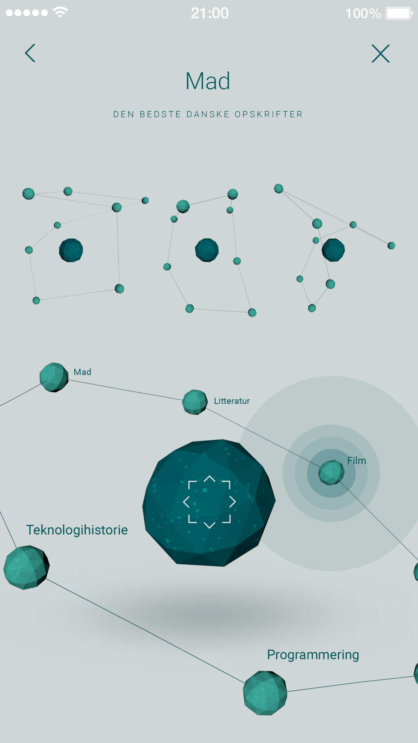
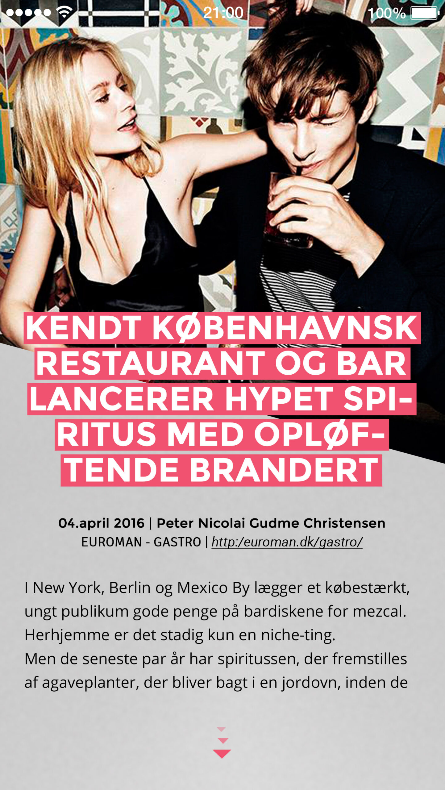
Danskerne Digitale Bibliotek
CLIENT
-
Danskerne Digitale Bibliotek
AGENCY
-
Freelance
-
2016
SERVICES
-
App Design
-
UX & UI Design
-
Visual & Digital Design
DELIVERABLES
-
App's Concepts Design
-
User Interface Animation
-
Interactive Prototypes


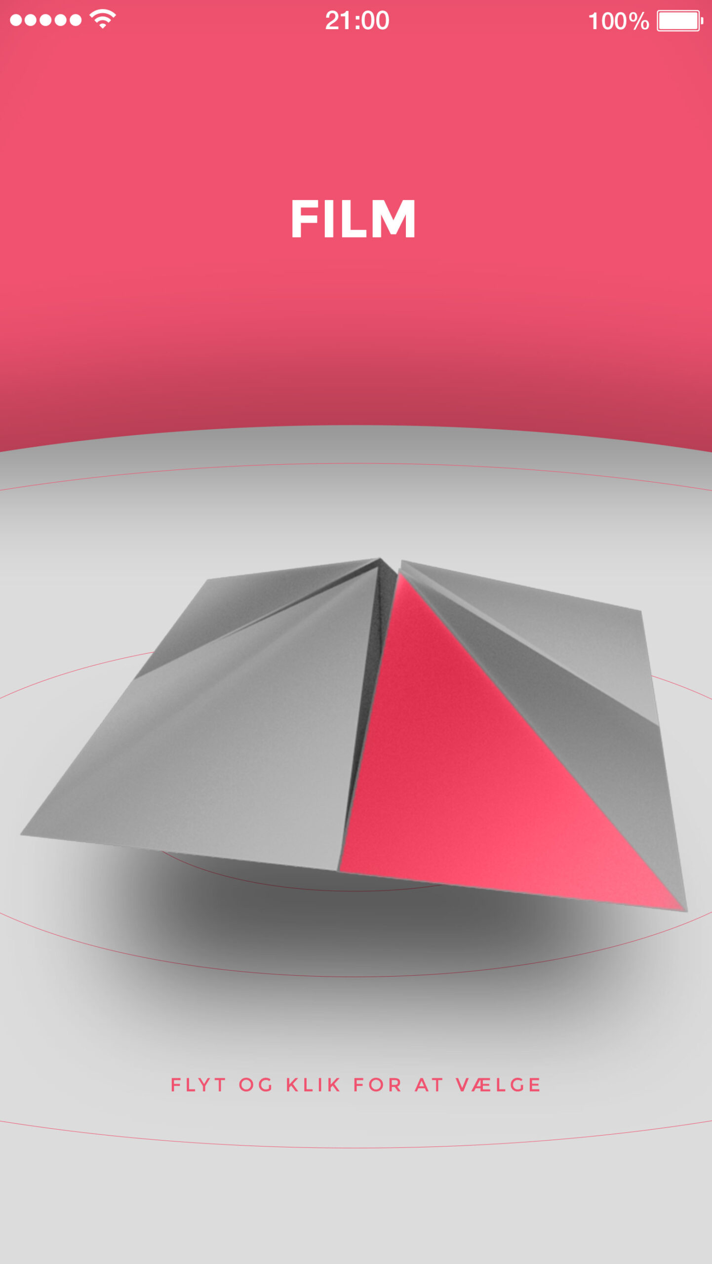

Brønden icon V1 (Selected)
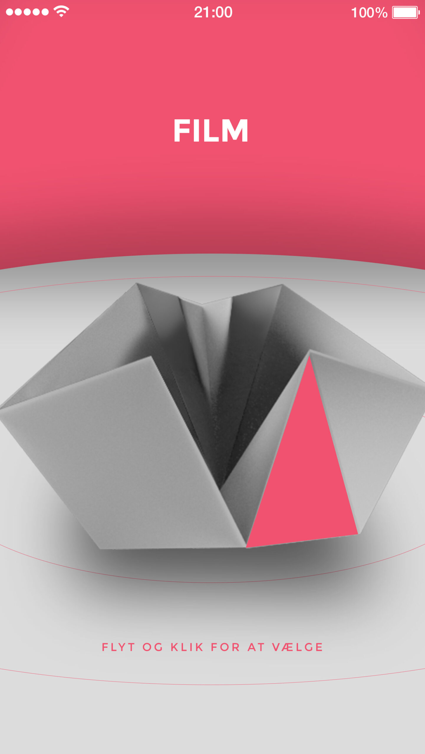
Brønden icon V2
Brønden icon V3

