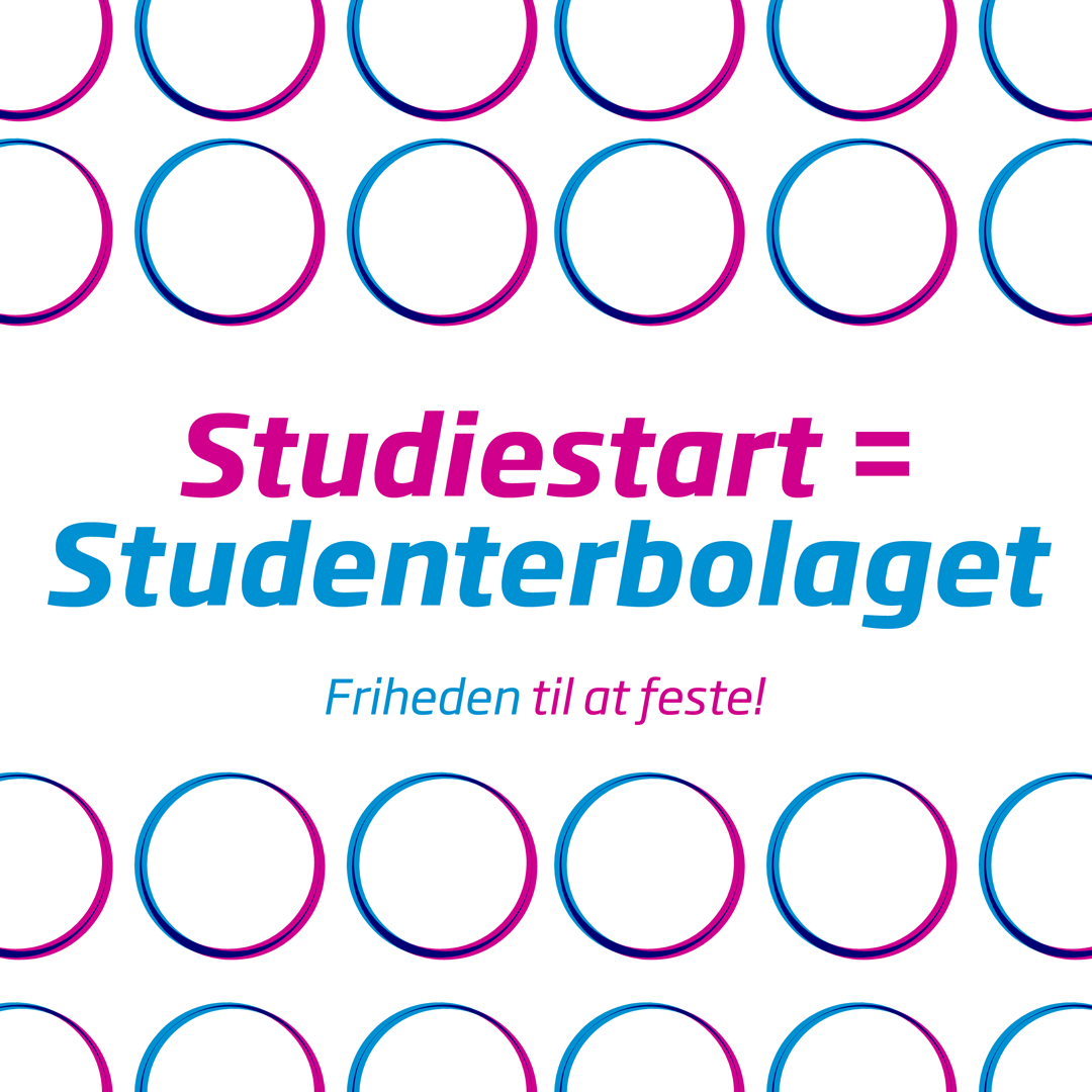
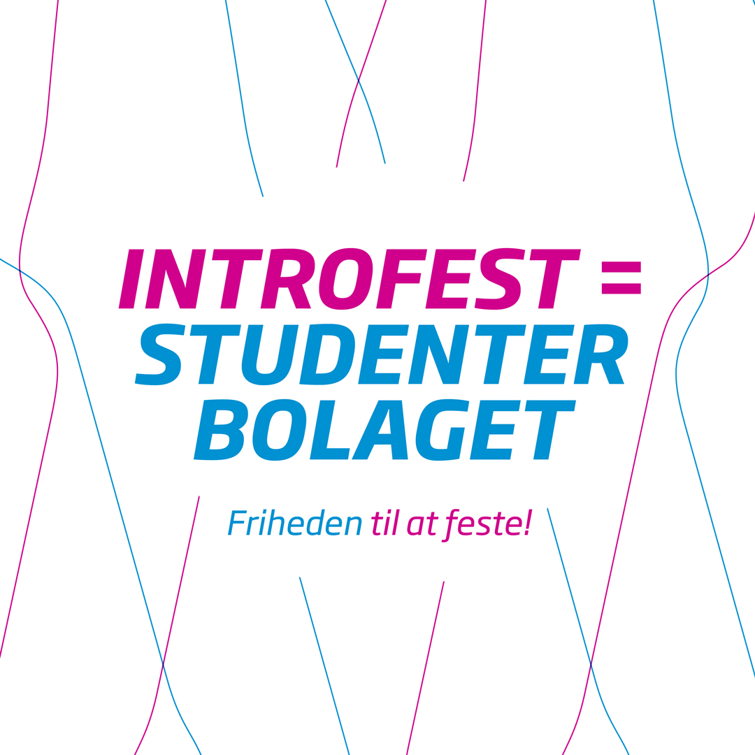
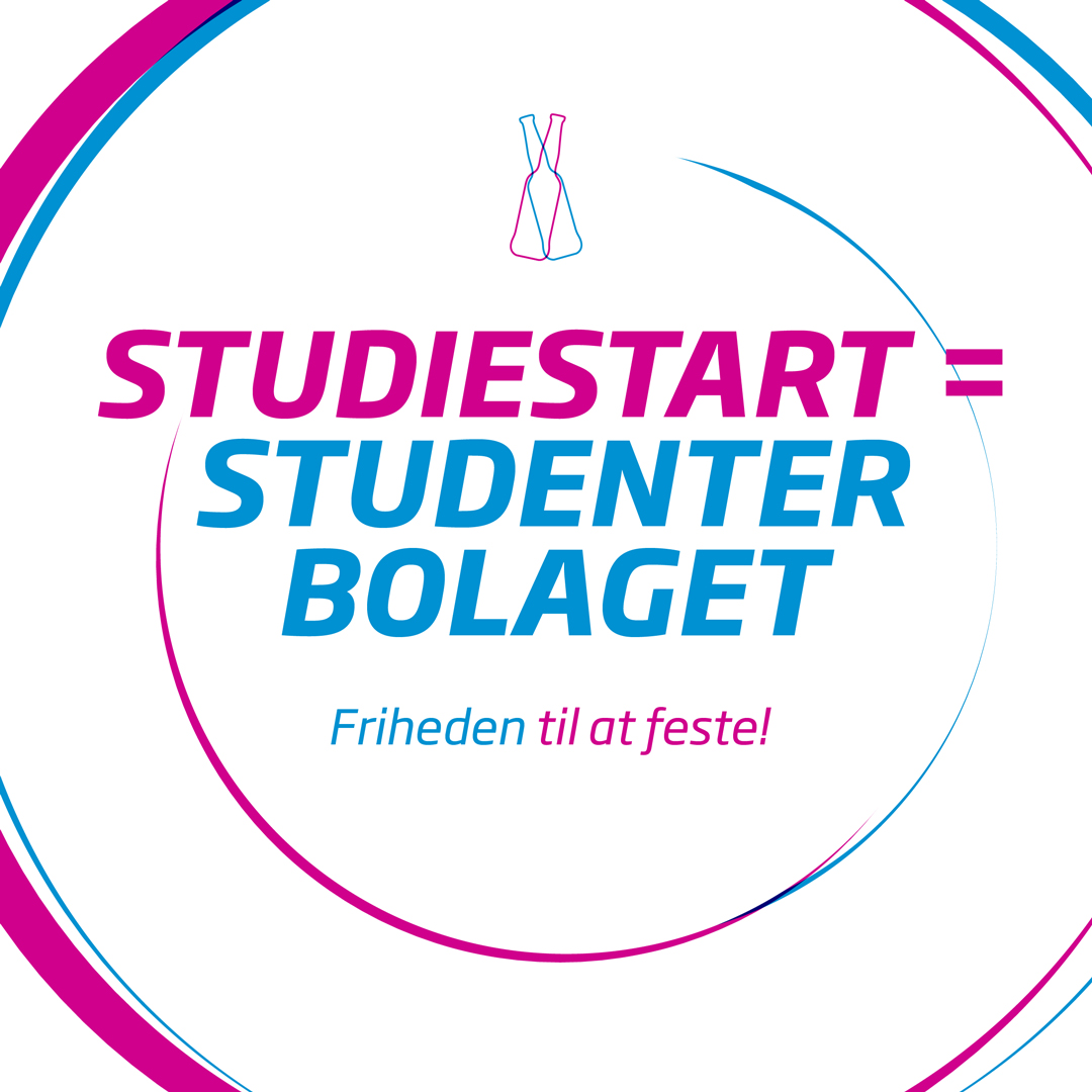
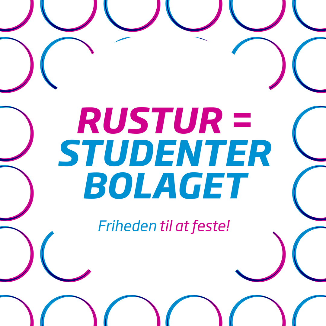
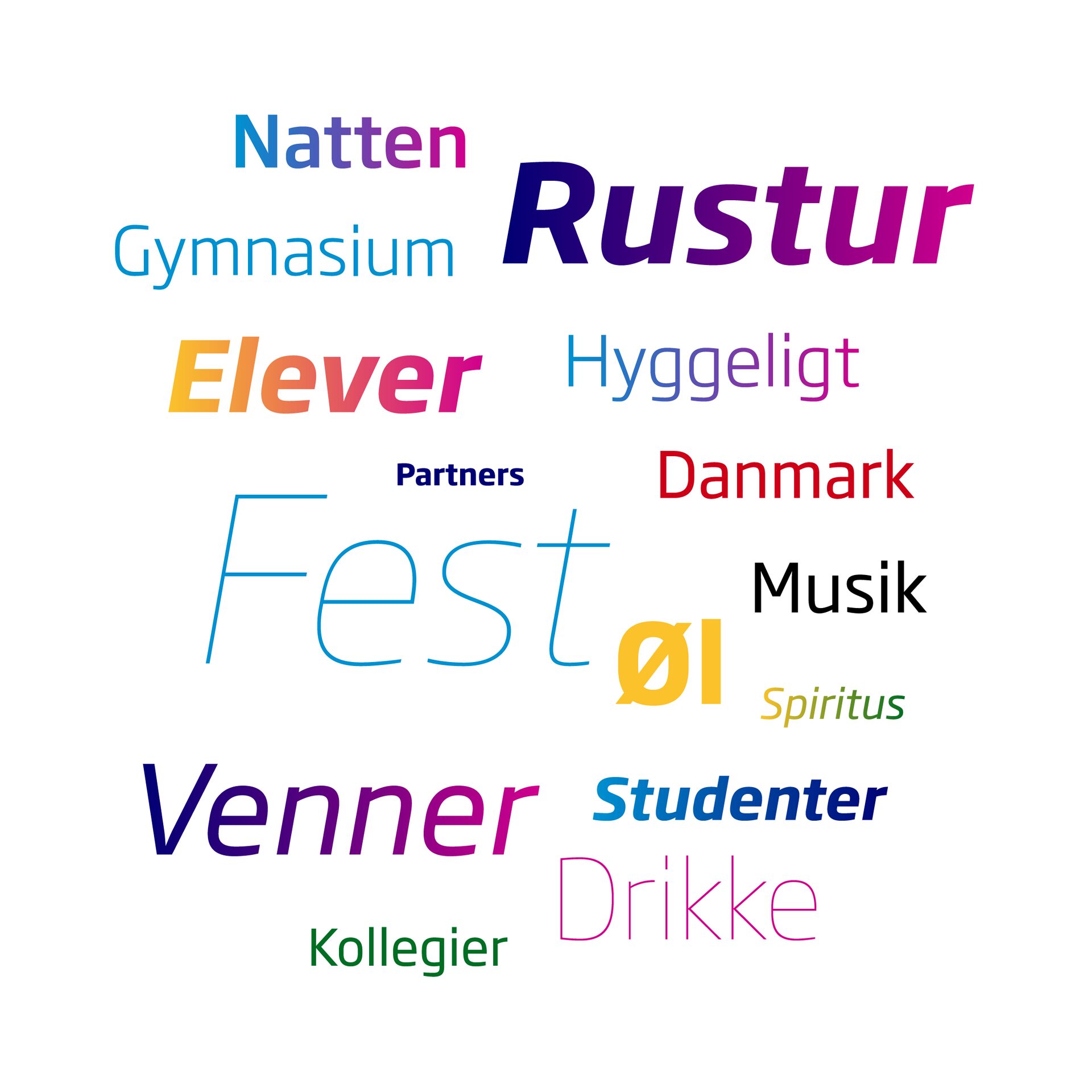
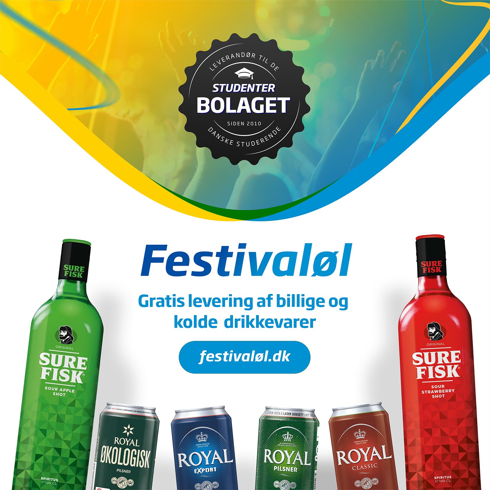
Portfolio Hero Image EXD Website Orderly App Visual Concept by José Francisco Sesé

Studenterbolaget

CLIENT
  • Studenterbolaget
AGENCY
  • Freelance
  • 2015-2019
SERVICES
  • Graphic Design
  • Brand & Marketing
  • Art Direction
  • Web Design (Front-end)
  • Digital Marketing Content
DELIVERABLES
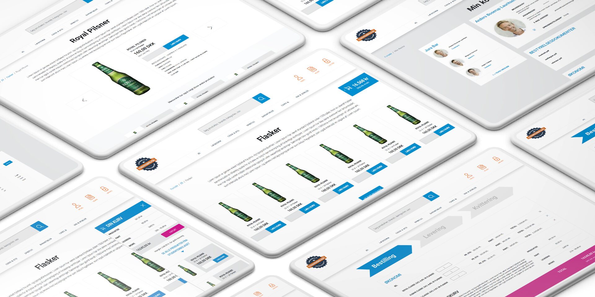
  • Webshop and Landing Page
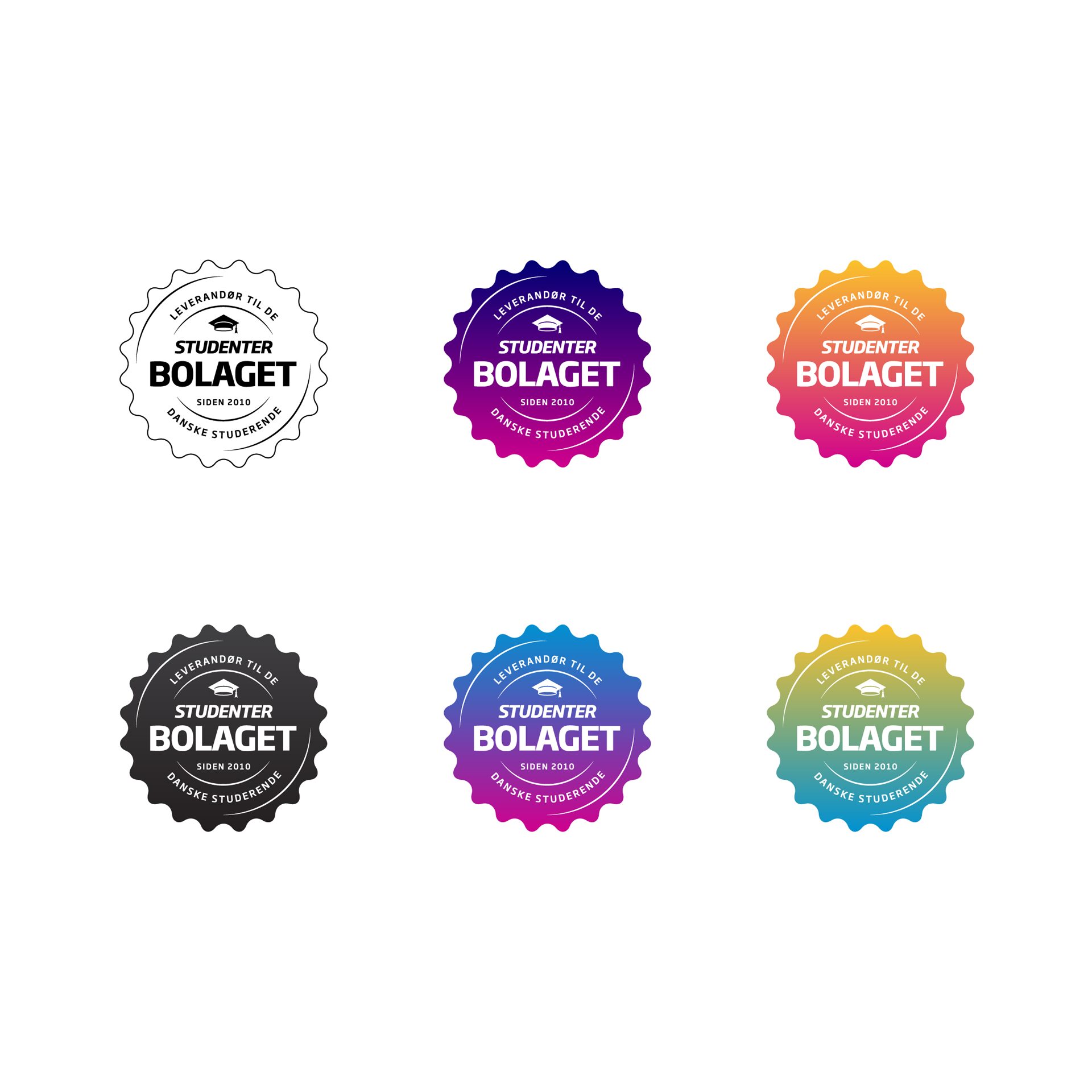
  • Corporate Visual Identity
  • Flyers, Folders and Ads
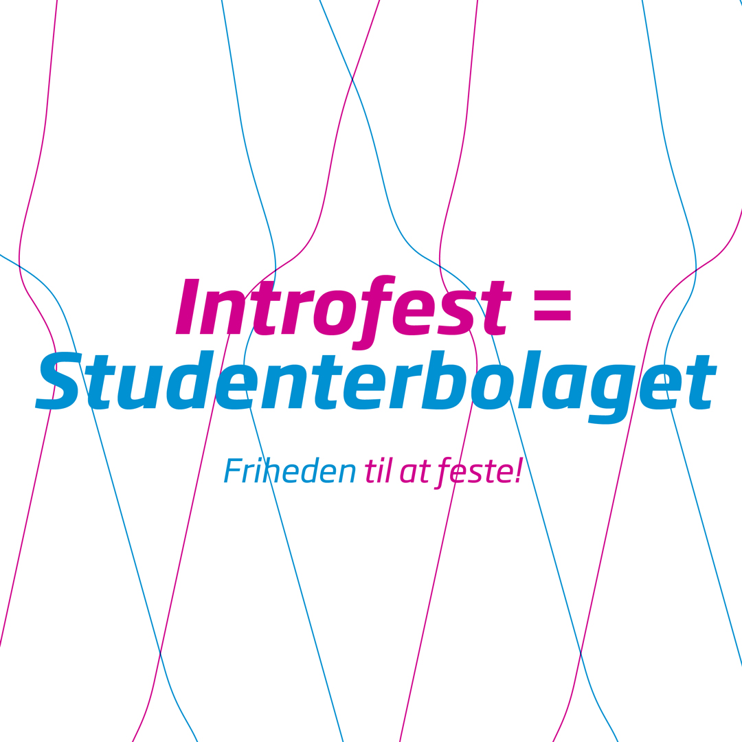
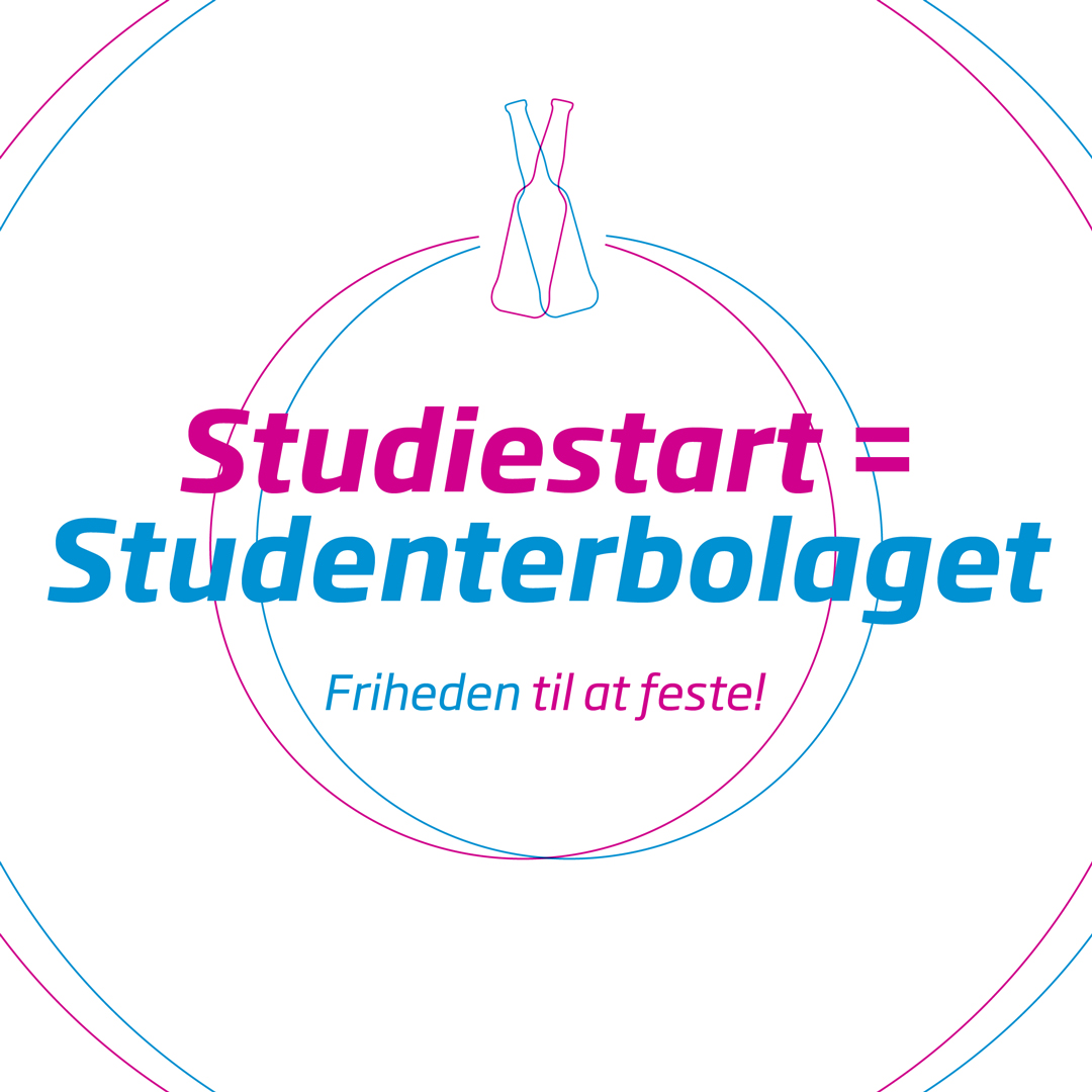
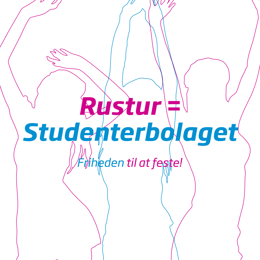
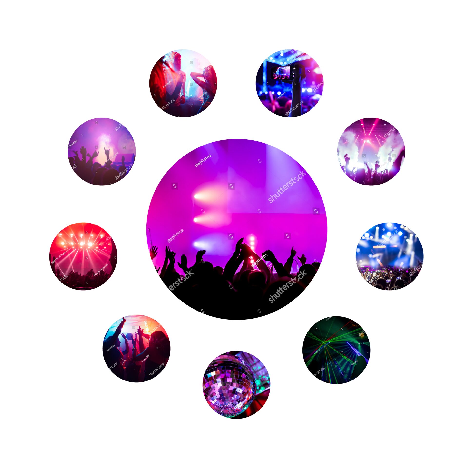
  • Social Media Content
  • Event Design Materials

Webshop

Markup / Front-end
HTML / CSS (Bootstrap 4.0)

SoMe

Designs for printning

Event designs

The Unofficial Beer Pong championship in Denmark is an event organized by Studenterbolaget - I've designed the event's logo, Social Media posts and winners' diplomas for this.​

Studenterbolaget

Visual identity

The concept for Studenterbolaget's visual identity is built upon one of the company's core values: variety. One of the benefits delivered by Studenterbolaget to the customers through the wide range of products (beverages) offered. To visually convey this value, inspiration was drawn from the vibrant lighting and diverse shapes of the beverages served at parties.

Inspiration

The energetic atmosphere of youth celebrations and music events serves as a key inspiration. The youth (the main characters in this story) celebrate and have fun at parties and/or music events. The spilled lights often play an important role, defining a scene and determining aesthetics.

Colors

The color palette reflects the primary colors commonly used in light spots – red, green, and blue. These colors, when mixed together using additive or subtractive methods, generate new colors, symbolizing the expansion of options and the sense of variety and diversity.

RGB (0, 145, 209)

#0091D1

RGB (251, 194, 43)

#FBC22B

RGB (208, 0, 141)

#D0008D

RGB (0, 0, 116)

#000074E6

RGB (205, 0, 24)

#CD0018C9

RGB (0, 110, 35)

#006E23

Logo

The logo has been refreshed with a simplified and compact form, ensuring easy legibility in various placements. Additionally, it allows for flexible color variations to adapt to different contexts.

Grafisk

This idea of variety is further echoed in the packaging and content of beverages for events and parties. The design incorporates curved shapes that represent the contours of the bottles and their liquid contents.

Typeface

Soho Gothic Pro is a modern sans-serif typeface that ensures excellent readability. Another reason for choosing this typography (with all its variations) is its versatility, working well for both headings and longer texts.

In summary, Studenterbolaget's visual identity captures the essence of variety through a dynamic color palette, curved shapes inspired by beverage contours, and a versatile logo. This visual concept embodies the essence of Studenterbolaget, reflecting its commitment to providing diverse and exciting beverage options for events and parties.